Compare locations
Select two or more states, metros, counties, or cities in Explore to see them side by side: a compact panel in the right rail, or a full comparison screen with a metric-by-metric table and best-value highlighting.
Before you start
- Comparison lives inside Explore, not as its own sidebar item. There is no standalone Compare screen; you build a comparison by selecting locations on the Explore map, table, or grid at whichever level you're viewing (State, Metro, County, or City).
- You need at least two selected locations at the same level before a comparison panel appears. See Explore a location for how selection works at each level.
- Economic Development Districts compare differently — see Explore EDD regions.
Steps
Select locations to compare
- At State and County level, click a location on the map or its row in the table or grid. Each click adds to your selection; clicking a second, third, and so on location keeps building the set instead of replacing it.
- At Metro level, tick the checkbox on a metro's row in the table, or click a bubble on the map or an entry in the Top 5 Metros card; either way adds it to the selection. Metro selection is capped at 5, and the cap is silent — a sixth click simply does nothing.
- At City level, tick the checkbox on a city's row in the grid. This is a separate action from clicking a city to open its detail panel: the checkbox controls what's in the comparison, while clicking a row just opens that one city's details. City selection is capped at 5; trying to check a sixth shows "Compare holds up to 5 cities — remove one first."
State and County are the only levels where you can select more than 5 locations at once.
Open the comparison panel
Once you have 2 or more locations selected, the right-hand rail turns into the comparison panel described below. What the toolbar's Compare button does depends on the level:
| Level | Toolbar Compare button |
|---|---|
| State | Appears at 2+ and opens the full-screen comparison |
| County | Appears at 2+ and opens the full-screen comparison |
| Metro | Always visible with a count badge, disabled below 2, then opens the full view |
| City | Appears at 2+ but only closes the open city panel to reveal the comparison rail |
At City level, use Full comparison in the panel to open the full-screen view — the toolbar button will not do it.
Read the side panel
With 2 or more locations selected, the right-hand rail becomes a compact comparison panel:
- A header reading "Comparing N states" (or metros, counties, cities), with a Clear link to drop the whole selection.
- If more than 5 locations are selected, a note like "Showing first 5 of 7 selected" — the panel and the full comparison both cap at 5. Only State and County can get into that situation.
- One row per selected location, colored to match the rest of the panel, showing its name, a subtitle (population, or state and CDP status for cities), and its Composite Score. Click the ✕ on a row to drop that one location from the comparison.
- A Full comparison button that opens the full-screen view.
- A radar chart overlaying each location's Cost, Workforce, Risk, Quality, and Regulatory scores, so you can see shape differences at a glance. City level skips this: cities have no composite or category scores, so their panel goes straight from the location rows to the metric table.
- A metric-by-metric table grouped by category (Layer Scores, then each data-layer group). The best value in each row is shown in green with a trophy mark. At City level, a value inherited from the city's county (rather than measured at the city itself) carries a small "County" tag, and a value suppressed at that population size shows as "—".
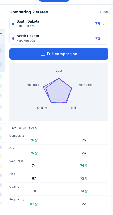
The colored dots
Each location in a comparison is given one of five fixed colors in the order you selected them. The same color follows that location everywhere in the comparison: its row in the panel, its line on the radar chart, its outline on the map at Metro and City level, its bar in the Score Breakdown chart, and its card in the full view. Remove a location and the remaining ones keep their colors in order.
How the best value is chosen
The green highlight and trophy mark the best value in a row, but only when the row can actually be won:
- The metric must have a direction. Population, Median Age, Metro GDP ($M), and Per Capita Income at metro level are direction-neutral — a higher number is neither better nor worse — so those rows never get a trophy.
- At least two locations must have a number on that row. If only one has a value and the rest show —, no trophy is awarded.
- Yes/no metrics such as Right-to-Work never compete, and — never wins.
- A tie awards the trophy to every location that ties.
Open the full comparison
- Click Full comparison in the panel, or Compare in the toolbar at
State, County, and Metro level, to open the full-screen comparison view.
It shows the same locations across the full width of the screen:
- A header ("State Comparison", "Metro Comparison", "County Comparison", or "City Comparison") with a back button — Back to Map at State, County, and City level, Back to Explorer at Metro level.
- A card per location with its name and score. State and County cards show population, Metro cards show the metro's short code, and County cards show the state abbreviation alongside population.
- A Layer Score Comparison radar chart and a Score Breakdown bar chart (State, Metro, County only; City has neither).
- A detailed comparison table grouped by category (for example Workforce & Demographics, Cost Factors, Risk & Environment, Quality of Life, Regulatory & Policy at State level), one row per metric, with the best value in each row highlighted in green. At Metro level each metric label carries the name of its source.
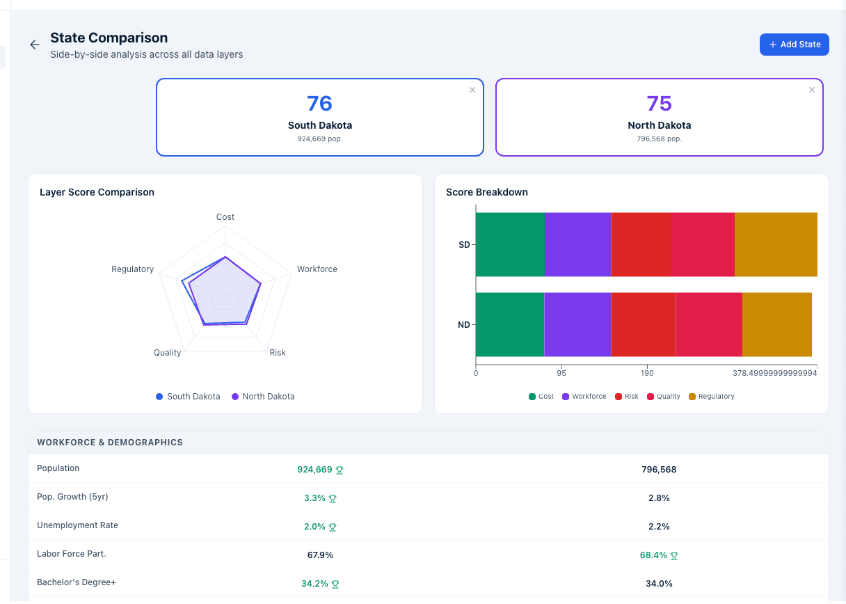
Add, remove, or swap a location
- From the full comparison view, click Add State (or Add Metro, Add County, Add City) and search for a location to add it, up to 5 total. The button disappears once you have 5. Click the ✕ on any location's card to remove it. There's no dedicated swap action: removing one and adding another has the same effect.
- Opening the full comparison with fewer than 2 locations selected shows an empty state instead ("Select 2–5 states to compare side-by-side across all metrics.") with buttons to go back to the map or add locations directly.
City comparisons carry county indicators too
A city comparison adds a County & city-source indicators section below the fourteen city indicators. Hovering a cell tells you whether the value was measured for the city itself or inherited from its principal county, and names the source and period. The section footer spells the rule out: native rows are Census ACS 5-Year city estimates, county-labelled cells inherit each city's principal county. See City-level data.
Economic development organizations typically select their own state, metro, or county alongside two or three competitor locations to see how they stack up category by category, then pull the best-value highlights into a pitch or marketing deck.
Site selectors typically select every candidate location on a shortlist at once and use the full comparison table to eliminate locations that lose on a hard requirement, before narrowing to a final recommendation.
What happens next
- At State level only, your selection (and so your comparison) is
written into the page's URL as
?states=, so copying and sharing that URL with a colleague reopens Explore with the same states selected and the same comparison panel available. Metro, County, and City comparisons are not reflected in the URL; a colleague needs to rebuild the selection by hand. - There is no export or print action for a comparison. To get the underlying numbers, use Export on the Explore toolbar with the same locations selected — see Export and CSV formats — or click Create report to produce a comparative report.
- A standalone Compare tab existed in an earlier version of Insights.
Old links to it still work: they redirect into Explore, carrying over a
?states=selection if the old link had one, and land you on the same side panel and full comparison described here.
Common questions
Q: How many locations can I compare? A: Two is the minimum. Five is the maximum shown at every level — State and County let you select more than five, but the panel and full comparison still show only the first five, with a note saying so. Metro and City stop at five selections outright.
Q: Can I compare a state with a county, or a metro with a city? A: No. Comparison only works within one geography level at a time. Switching levels in Explore clears your selection, so build your comparison after you've picked the level you want.
Q: At City level, why does the Compare button just close my city panel? A: At City level the toolbar Compare button only dismisses the open city detail so the comparison rail underneath is visible. Use Full comparison in that rail to open the full-screen view.
Q: Why is Compare greyed out at Metro level? A: The Metro toolbar always shows the button, disabled with a count badge until two metros are ticked. Tick a second metro and it becomes active.
Q: Why can't I add a sixth metro — nothing happens when I click? A: Metro selection is capped at five and the cap is silent, so a sixth click is simply ignored. Untick one metro to make room.
Q: Why is there no trophy on the Population or Metro GDP rows? A: Those metrics are direction-neutral — bigger is not automatically better — so no location can win them. Rows only get a trophy when the metric has a direction and at least two locations have a number on it.
Q: Why did nobody get the trophy on a row where one location clearly has the best value? A: A row needs at least two numeric values to be compared. If the other locations show —, there is nothing to compare against, so no highlight is awarded.
Q: What do the colored dots next to each location mean? A: They are the series colors for the comparison, assigned in selection order. The same color identifies that location on the radar chart, the bar chart, its card, and its outline on the map.
Q: Can I export or print the comparison table? A: Not directly. Export the same selection from the Explore toolbar for the raw numbers, or click Create report to generate a comparative report you can download.
Q: I don't see a Compare button. Why? A: You need at least 2 locations selected at the current Explore level. Below 2, State, County, and City show no Compare button, and Metro shows its button disabled.
Q: Is this the same as the Compare tab under Incentives? A: No. That's State Incentive Benchmarking, which compares states' incentive programs and award activity, not their economic and demographic metrics. See Incentive Intelligence.
Related
Last updated on