Create and export Insights reports
Pick a report type and one or more locations, generate a profile or comparative report, download it as a PDF, and revisit past reports from the report history list.
Before you start
- Reports is one of the sidebar areas inside Insights, alongside Ask, Explore, Analyze, and Incentives. Its landing screen is headed Reports — "Generate comprehensive, narrative-driven market reports for any location."
- A report always covers a location: a state, a metro area, a county, a city, or an Economic Development District (EDD), an EDA-designated region with its own coded economic-development priorities (see Explore EDD regions).
- You can also start a report from Explore or from the Incentives catalog, without visiting the Reports tab first. See What happens next.
Steps
Choose a report type
- On the Reports tab's landing screen, pick a card from Choose a report type. Each card names the audience it's built for (for example "State EDOs & Policymakers" or "Site Selectors & Regional EDOs") and shows an example subject; the City report and District Priorities cards also carry a City level and an EDD chip.
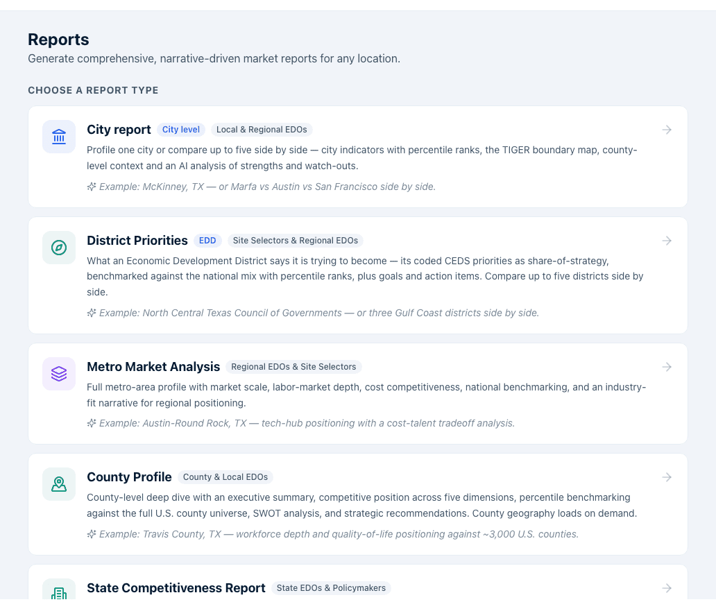
Which report type fits which place
The search pool depends on the report type, not on where you started:
| Report type | Searches |
|---|---|
| City report | The full city place index |
| District Priorities | EDD districts |
| Metro Market Analysis | Metros |
| County Profile | Counties |
| State Competitiveness Report | States |
| Incentive Landscape | States |
| Board Intelligence Brief | States and metros together |
| Economic Momentum Report | States and metros together |
Board Intelligence Brief and Economic Momentum are the two that mix levels — their picker is labelled Select up to 5 locations and searches states and metros in one list. Counties are only reachable through County Profile, and county geography loads on demand ("Loading county geography…", or "Couldn't load county data" with a Choose another report link if it fails).
Pick a location or locations
- Type into the search box to find a subject. The helper below the picker reads "Type to search, then pick up to 5 locations to enable Generate."
- Add up to 5 locations. Adding a second location switches the button to Generate comparative [report name]; the field shows how many of the 5 you've used. Remove a location by clicking the X on its chip.
- Click Generate [report name] (or Generate comparative [report name] for 2 or more). One location produces a standard profile report; two to five produce a comparative report with every location side by side.
Read a profile report
A single-location report opens with:
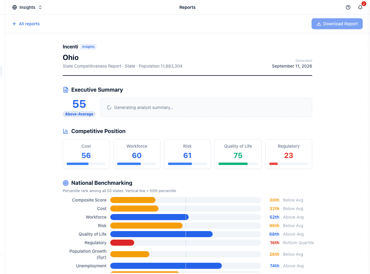
- An Executive Summary with the composite score, a tier badge, and an AI-written analyst summary: a short narrative generated from the report's own numbers, not a live chat. While it is still generating, the summary area shows a loading state; if generation fails, a template-based summary appears instead, so the report is never empty.
- Competitive Position: the five layer scores (Cost, Workforce, Risk, Quality of Life, Regulatory) as tiles with a bar under each.
- National Benchmarking: every key metric shown as a percentile bar against the full pool of locations at that level, labelled Top Quartile, Above Avg, Below Avg or Bottom Quartile.
- SWOT Analysis: strengths, weaknesses, opportunities, and threats, preferring the AI narrative's points and falling back to deterministic ones where the narrative has none.
- Key Metrics vs. National Average: a table of the location's value, the national average, its percentile, and whether it beats the average.
- Strategic Recommendations: a numbered list of suggested talking points.
A Metro Market Analysis (and any comparative report across metros) also carries a CBSA boundary map figure.
How tiers, percentiles and the national average are computed
The tier badge in the Executive Summary comes straight from the composite score: Top-Tier at 65 and above, Above-Average at 50, Mid-Range at 35, Below-Average below that.
A percentile is a direction-aware rank inside the pool of every location at that level — all served states, all served metros, or roughly 3,000 counties. The best performer is always the 100th percentile, whether the metric is one where higher wins (broadband access) or lower wins (violent crime, tax climate rank). The national average on the Key Metrics table is the plain mean of that same pool, so both figures move as coverage grows.
Which metrics are benchmarked depends on the level. States are benchmarked on the composite, the five layers, 5-year population growth, unemployment, labor-force participation, bachelor's-or-higher, median household income, electricity rate, broadband access and violent crime rate. Metros and counties swap median household income for median wage and add per-capita income, median home value and median rent.
The AI summary and its fallback
The Executive Summary and the SWOT points are produced by one call over a short list of pre-computed facts about the location — the same numbers already on the page. Nothing is invented and nothing is fetched live.
If that call fails, the report silently shows a template-written summary and the deterministic SWOT instead. There is no on-screen indicator telling you which one you're reading. The deterministic version always opens with "<Location> is a <tier> location with a composite score of N/100" and names its strongest and weakest dimension — if your summary reads like that, it's the fallback. Regenerate the report to try again.
The deterministic SWOT follows fixed rules: a layer scoring 65 or more is a strength and 35 or less a weakness; population growth above 5%, broadband at 90% or better, or unemployment at 3.5% or lower add strengths; population decline or broadband under 70% add weaknesses. Recommendations are capped at four.
Incentive Landscape report contents
The Incentive Landscape report is a state profile report plus six incentive sections. Everything a State Competitiveness Report shows — Executive Summary, Competitive Position, National Benchmarking, SWOT and Key Metrics — is still there; the incentive sections are inserted between Key Metrics vs. National Average and Strategic Recommendations, in this order:
- Incentive Competitiveness Score — the ICS, a Tracked (normalized) value, and the four Score Components with their weights.
- Programs Offered — a whole-state program type mix bar above a table of Type, Program, Agency and Eligibility, with a count line for the report's scope.
- Award Value by Category — whole-state award dollars; program filters do not apply here.
- Top Recipients in XX — Company, Sector, Awards, Value.
- Award Tier Distribution.
- Recent Megadeals — up to 8.
The programs table is capped — past 40 rows it says Showing the first 40 of N programs in scope. — and notes that it "Includes untagged general-purpose programs available to any industry; industry-specific matches are listed first." A state with no award data on record shows No incentive award data available for this state. instead of the incentive sections. Everything on them is attributed to Incenti Subsidy Intelligence; see How Incentive Intelligence figures are computed.
The Incentive Landscape report is not available for the District of Columbia.
Read a comparative report
Selecting 2–5 locations produces a comparative report instead: a scorecard per location, a side-by-side layer-score table with the leader on each dimension marked, a merged national-benchmarking table (best value per metric highlighted), a strengths-and-weaknesses card per location, and comparative recommendations.
The City report and District Priorities report have their own layouts. A City report runs Executive Summary (a verdict with Why it's strong and Watch-outs), How <city> ranks, City indicators, County-level indicators — <county>, and a boundary map; its comparative version runs Executive Summary, Composite standings, Indicator comparison and Full comparison. District Priorities runs Executive Summary, Business Priorities, Benchmark vs. National Mix, What this means and Goals & Action Items; its comparative version runs Districts, Priority Leaders, Benchmark vs. National Mix, Best Fit by Project Type, Priority Mix Comparison and Takeaways.
Export the report
- Use the toolbar at the top of the report:
- All reports returns to the report-type picker without losing the report from history.
- Download Report generates the report's PDF. For most report types this also saves the PDF to the report's history row so it can be reopened later; while the AI summary is still generating, the button is visually disabled and clicking it shows "The summary is still being generated. Please wait for it to finish before downloading." A saved PDF opens in a new tab with the toast Report PDF saved; a failure shows "Couldn't generate the PDF — please try again."
- A comparative report for states, metros, or counties does not offer a PDF yet: its Download Report button stays disabled. See Common questions.

On an Incentive Landscape report, Download Report also waits for the programs and recipients data to load before it will save.
Revisit report history
The Reports tab's landing screen also lists Recent reports: the 50 most recent reports anyone on your account has generated, newest first, with who generated it ("Generated by You", or the teammate's name) and when, and a badge for the surface it came from — Reports, Explore, Analyze or Incentives. With nothing generated yet it reads No reports generated yet. Each row shows:
- Open — reopens the report by re-resolving its saved locations.
- Open in Analyze — for a compete report generated from Analyze; it takes you to the Analyze wizard instead of rendering inline here.
- Unavailable — the report's recipe couldn't be read, so it can't be reopened; only the record of who generated it and when remains.
- A PDF link, once a Download Report save has produced one.
- A trash-can icon to delete the row. It asks Delete report from history? and warns that the report "will be removed from Recent reports for everyone on your account."
Rows are named after their subject: <Location(s)> — <Report type>,
<Community> — Compete Report, or <State> — Incentive Landscape · <scope>.
Re-opening older reports
A history row stores a short recipe — the report type and its locations — rather than a frozen copy, so a report is rebuilt from current data when you reopen it. Where that can't be done you'll see one of these:
- This report type is no longer available. or the full-page Report type retired — that report type has been withdrawn.
- <Name> is no longer available / Some locations are no longer available — one or more of the saved locations has gone from the current data (a rare geography change).
- Couldn't load county data — the county dataset didn't load; try again.
Each full-page notice has a Back to reports button.
Rows generated as the retired Community Profile report still reopen — they are resolved through the City report by matching their saved subject names. If those names can't be matched to the city place universe, you'll get the Report type retired notice explaining that Community Profile has been replaced by the City report.
What happens next
- Generating a report immediately records a row in report history, even before you download anything — history tracks every report generated, not just saved PDFs.
- Report history is account-wide: everyone on your account sees every report generated from Reports, Explore, Analyze, and the Incentives catalog in one shared list, trimmed to the 50 most recent.
- Create report in Explore, the report launcher inside Analyze, and Create report on the Incentives Programs tab open the same standardized report on top of your current selection — you don't have to re-pick locations on the Reports tab. Compete reports built through Analyze appear in this history too, but only reopen through Analyze, not inline here; once their PDF has been saved, the PDF link on the row works like any other.
- The other buttons on the Incentives screen — Export Report on Compare, Companies and Megadeals, and State Report on Explorer — are print-only and never reach this history. See Reports and exports from the Incentives screen.
Economic development organizations mainly generate a profile report for their own state, metro, county, or city — pulling the Executive Summary, score tiles, and SWOT straight into a board packet or an attraction pitch deck, and reaching for the Incentive Landscape report when a prospect asks what incentive programs are on offer.
Site selectors mainly generate a comparative report across a client's shortlist — 2 to 5 candidate locations at once — so the scorecards, benchmarking table, and per-location strengths-and-weaknesses cards can go straight into a site-selection deliverable without manual side-by-side formatting.
Common questions
Q: Which report types can I run for a metro or a county? A: Metro Market Analysis for metros, County Profile for counties — and Board Intelligence Brief and Economic Momentum Report, whose picker searches states and metros together. Counties are only available through County Profile. Incentive Landscape and State Competitiveness are state-only.
Q: How is the percentile and "national average" calculated, and against how many places? A: Both are computed over every location at that level — all served states, all served metros, or roughly 3,000 counties. The percentile is a direction-aware rank, so the best performer is the 100th percentile whether higher or lower is better on that metric, and the national average is the plain mean of the same pool.
Q: How do I know whether the Executive Summary was AI-written or the fallback? A: There's no indicator on the report. The fallback text is templated and always opens with "<Location> is a <tier> location with a composite score of N/100", then names its strongest and weakest dimension. If yours reads that way, generation failed — regenerate the report.
Q: Can I regenerate the AI summary on its own? A: No. The summary is produced once per report and cached for the rest of your session. Generate the report again to get a fresh one.
Q: Why does my Incentive Landscape report say "Showing the first 40 of N programs"? A: The programs table is capped at 40 rows so the report stays readable and printable. Use the Programs tab on Incentives to browse a state's full catalog, and filter there before clicking Create report if you need a narrower list in the report itself.
Q: Why does the report's Programs Offered section say my state's list isn't complete? A: Because that state's catalog coverage is partial — some programs are verified but the benchmark says more exist. The banner is deliberate: the list is accurate as far as it goes, but it isn't exhaustive yet. See How Incentive Intelligence figures are computed.
Q: Why did my old "Community Profile" report open as a City report? A: Community Profile has been replaced by the City report, and old rows are resolved through it by matching their saved subject names. If the names can't be matched, you'll get a Report type retired notice instead.
Q: Why is the PDF link missing on a row I generated? A: A PDF link only appears after a Download Report save has actually produced a file. Generating a report records the row; it doesn't create a PDF. Reopen the report and click Download Report.
Q: How many reports does Recent reports keep? A: The 50 most recent for your whole account. Older rows drop off the list, so download the PDF of anything you need to keep.
Q: Why does an older report say "Unavailable" instead of letting me open it? A: A report's history row stores a small recipe (which report type and which locations) rather than a frozen copy of the report. "Unavailable" means that recipe couldn't be read — usually because it came from a report type that's since been retired. The row still shows who generated it and when; it just can't be regenerated.
Q: Can a colleague see my reports, and who can delete them? A: Recent reports lists every report generated by anyone on your account, not just your own, and any teammate on the account — admin or not — can delete a row. Deleting removes it for everyone, which is why the delete button asks for confirmation first.
Q: Why does the PDF differ from what I see on screen? A: It shouldn't — Download Report captures the exact on-screen state (scores, narrative, benchmarking rows) into the PDF rather than recalculating anything, so what you see when you click Download Report is what gets saved. If the AI summary was still generating when you clicked, wait for it to finish first; downloading mid-generation is blocked so you don't save an incomplete report.
Q: How do I add more than 5 locations to a report? A: Reports cap every location picker at 5, whether you're building a profile or a comparative report. If you need to cover more locations, run a second report, or use Explore's CSV export (up to 10 states, metros, or counties, and 15 cities) for a broader data pull outside the report format.
Q: I generated a comparative report but the Download Report button looks disabled. Is that a bug? A: PDF download is not available yet for a comparative report of states, metros, or counties; the button is disabled on purpose there. City and District Priorities comparative reports, and every single-location report, do support Download Report. For a state, metro, or county comparison, generate a single-location report per location, or export the same selection as CSV from Explore.
Related
Last updated on