Explore a location
Browse states, metros, counties, and cities on the map, table, or both, filter by any metric, select a location to see its detail metrics and benchmarks, and export or start a report from your selection.
Before you start
- Explore is one of the sidebar areas inside Insights; open it from the
sidebar or by going to
/insights, which lands there by default. - Explore works at four geography levels: State, Metro, County, and City. Switch levels with the buttons at the left of the toolbar. Each level has its own view mode, search, filters, and metric dropdown.
- The right-hand detail panel and the TOP 5 card are hidden on narrow screens. Use a laptop-width window to read a location's details.
Steps
Choose a level
- Click State, Metro, County, or City in the toolbar. The map, table, metric list, and filters all change to match the level you picked. County and City load their data the first time you enter them, so expect Loading county geography… or Loading city data… briefly.

Pick what the map or table colors by
Next to the view mode buttons is a metric dropdown. It sets which metric colors the map and which metric the TOP 5 list ranks by, at every level that has one. Composite Score blends every category into one 0–100 number; Cost Score, Workforce Score, Risk Score, Quality of Life Score, and Regulatory Score are the same blend limited to one category.
What the dropdown offers differs by level:
| Level | Dropdown contents |
|---|---|
| State | The 6 scores plus 12 metrics — not the full state catalogue |
| Metro | The 6 scores plus Population, and only in Map or Split view |
| County | The 6 scores plus all 24 county metrics |
| City | The 14 city indicators, no scores; labelled Color by metric |
If a metric you want is not in the State dropdown — natural gas price, workers' comp, physicians, violent crime and others are not — read it from the detail panel or the table instead.
Switch between Map, Table, and Split
- Click Map, Table, or Split to change the layout.
- Map shows every location as a choropleth (State, County) or a bubble (Metro, City, sized by population and colored by the selected metric).
- Table replaces the map with a sortable list.
- Split shows the map on top and the table below at the same time.
In Split view at Metro, County, and City level, the table narrows to your selection as soon as you select anything — the report and export follow that same list. Table view always shows the full filtered set. State's Split view shows the full set either way.
Read the map
- The legend sits at the bottom left, running Low to High with the metric's name. For a metric where a lower value is better — unemployment, electricity rate, tax climate rank, disaster count, crime — the color ramp is reversed so that good always reads the same way. Right-to-Work colors green for yes and grey for no.
- Hovering a location shows a dark tooltip with its name, state, population, and the selected metric's value.
- County, Metro, and City maps have Zoom in, Zoom out, and Reset view buttons at the top right, and show the current zoom while you are zoomed in. The State map has no zoom.
- At County level, filtering or searching fades the non-matching counties rather than removing them; selecting a county fades everything else.
- The Metro map draws each metro as a bubble (Bubble size = population · color = …) and outlines a metro's boundary once you select it.
- The City map draws at most 2,000 markers at a time, so small places disappear when you zoom out and return as you zoom in. See City-level data.
Read the table
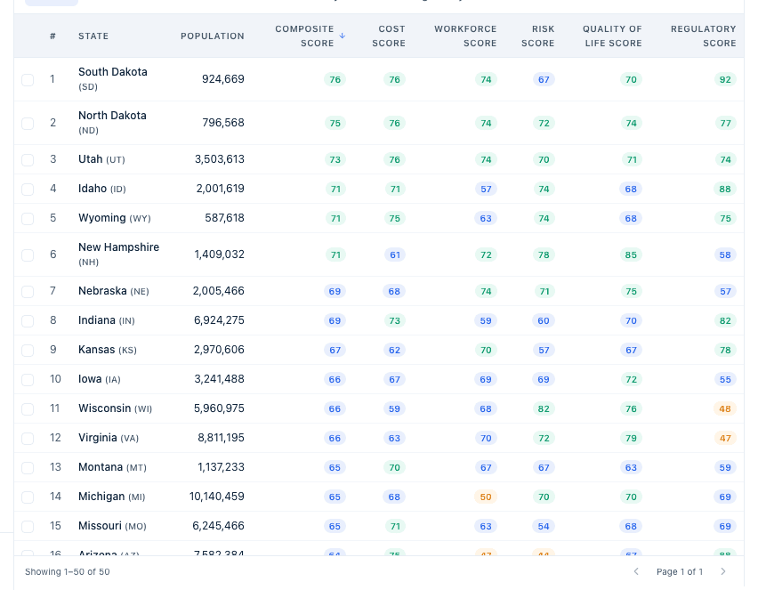
- The footer shows a count like 50 states · 2 selected, then Showing 1–50 of 3,143 and Page X of Y. Pages hold 50 rows.
- A
#column numbers the rows in the current sort. Click any column header to sort by it; the first click sorts descending, a second click flips it. - Tabs above the table swap which metric group's columns are shown: Scores, Workforce, Cost, Risk, Quality of Life, and Regulatory. At Metro level the last tab reads Regulatory (State). At EDD level the tabs are Scores and Category shares. City's table has no tabs — it shows City, Population, the active indicator, Median HH Income, and Median Home Value.
- With no matches the table reads No states match the current filters. (naming the current level's noun).
- The Metro table is different: no pages and no
#column, and clicking a row expands an inline detail row underneath it showing all five categories with the source name under each metric. The checkbox at the start of the row is what selects a metro.
Search for a location
- Type into the search box. The rules differ by level:
- Search states... matches on name.
- Search metros... filters the table and map in place as you type, matching name, short code, or state. There is no result list and nothing is selected for you.
- Search counties or cities... needs two or more characters and matches a county name, "Name, ST", a state code, a FIPS code, or one of a curated list of about 70 well-known city names — so "Lexington" finds Fayette County, but a city that is not on that list will not find its county. Up to 10 results, largest first.
- Search cities… needs two or more characters and returns up to 8 places by population, including census-designated places even when Incorporated only is ticked. No match reads No matches.
- Search EDDs… matches a district name, its state code, or the acronym of its name.
At State, County, City, and EDD level, picking a result selects that location and clears the box.
Filter by metric
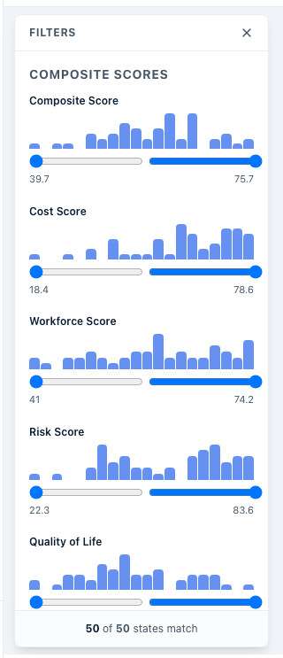
- Click Filters to open the filter panel. Each metric gets a slider with a mini histogram of the current level's values; drag either handle to set a range, or click Reset to clear one metric. Hovering a histogram bar shows how many locations fall in that bin. The panel is grouped under the same category headings as the data (Composite Scores, Cost Modeling, Workforce, Risk Assessment, Quality of Life, Regulatory & Policy). The bottom of the panel shows a live count, for example "8 of 50 states match." At State level the six Site Screening metrics — population, population growth, median age, median household income, poverty rate, and freight volume — have no sliders. City level's panel covers its 14 indicators, and adds an All states dropdown to focus one state and an Incorporated only checkbox to exclude census-designated places. Metro level has no Filters button.
The Filters button turns colored and shows a count while any filter is active. Press Escape, click outside the panel, or click the X to close it; a panel-level Reset appears once at least one filter is set.
Select a location
- How selection works depends on the level:
- State and County: click the location on the map or its row in the table. Each click adds to the selection rather than replacing it; click a selected location again to remove it, or click the X in the toolbar to clear everything.
- Metro: tick the checkbox on the row, or click the bubble on the map or an entry in Top 5 Metros. A row click expands the inline detail instead of selecting. Metro selection stops at 5 — further clicks are ignored with no message.
- City: tick the checkbox in the table to add a city to the comparison. Clicking a row or a map marker opens that city's detail panel without selecting it.
A N selected badge appears in the toolbar once anything is selected.
Hovering versus selecting
The detail panel follows your mouse. Hovering a state, county, or district on the map temporarily shows that location's details, and the panel reverts to your last selected location when you move away. With several locations selected, the panel shows the one you clicked most recently.
If the panel keeps changing while you read it, move the pointer off the map — it will settle on the last location you clicked.
Read the detail panel
The right-hand panel fills in with the selected location's details:
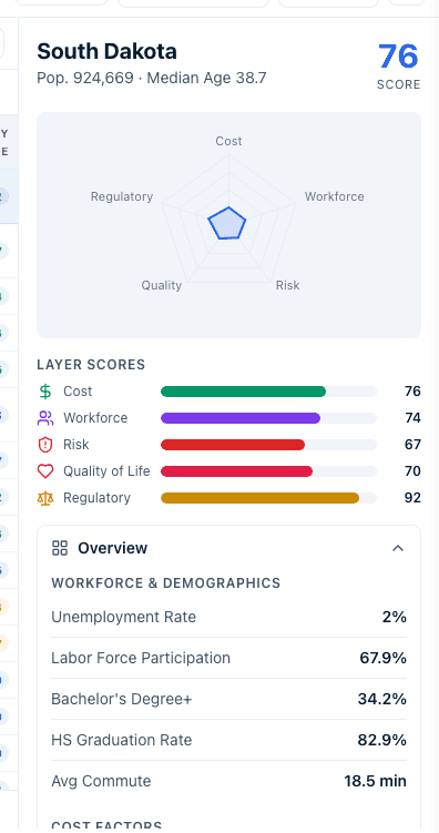
- A header with its name and population. State also shows Median Age; County shows the state and any city alias; City shows the designation, county, a CDP pill where relevant, and a Partial ACS coverage badge where some indicators are withheld.
- Layer Scores bars for Cost, Workforce, Risk, Quality of Life, and Regulatory, and — at State and County level — a radar chart of the same five scores.
- An accordion of collapsible sections: Overview, Insights, Benchmarks, SWAT Analysis, and, at State and County level, Regional priorities (EDD). Only Overview is open to begin with.
Not every level has all of this. The Metro panel is a reduced one — header, Layer Scores, and Metrics by category, with no Overview, Insights, Benchmarks, SWAT Analysis, or EDD section — and it only appears when exactly one metro is ticked, with no hover preview. The City panel is laid out differently again: City metrics (ACS-native), More indicators, AI Analysis, and About this place, plus a Close button. See City-level data.
Overview, and the Incentive Environment block
Overview lists the location's metrics. At State level they are grouped as Workforce & Demographics, Cost Factors, and Risk & Environment; at County level all 24 metrics are grouped by the five data layers, with the metric currently coloring the map highlighted.
Both State and County Overviews end with an Incentive Environment block drawn from Incentive Intelligence:
- An Incentive Competitiveness score out of 100, with a Limited disclosure flag where the state discloses too little for the figure to be reliable.
- Tiles for Total Value, Awards, Typical Award, and Large-Award %, then the top four award categories by share.
- A Programs Offered block counting the state's verified programs, with Coverage in progress while the catalogue is still being built out.
- A footnote reading Source: Incenti Subsidy Intelligence and, where normalisation applies, the window it covers.
At County level the block carries the note Incentive data is state-level; figures reflect the entire state, not this county. See Incentive Intelligence.
Insights, Benchmarks, and SWAT Analysis
- Insights is a set of short call-outs comparing the location with the national average — up to 4 cards at State level and up to 6 at County level, where the first card describes whichever metric is currently coloring the map.
- Benchmarks compares the location with everything else at its level. At State level it reads Ranked #X of N states and shows the six scores plus six key metrics, each with the national average, a rank pill, and a percentile. At County level it shows percentiles only — no rank — across 17 rows.
- SWAT Analysis is a strengths, weaknesses, opportunities, and threats summary (a standard SWOT, despite the heading) with a Strategic Trade-off card comparing the Cost and Workforce scores. Empty quadrants read None identified.
Everything in these three sections is generated by fixed rules from the numbers on the page — nothing here is written by an AI assistant. The exact thresholds are in How Insights scores are calculated.
Use the TOP 5 list
The map view shows a TOP 5 card — Top 5 States, Top 5 Metros, or Top 5 Counties — ranked by whichever metric the dropdown is set to. If you have a selection, the list ranks your selected locations; with nothing selected, it ranks the whole filtered set. Click any entry to select that location. City level has no TOP 5 list.
EDD regions
At State level, click EDD regions to switch the whole screen to an Economic Development District overlay: EDA-designated districts instead of states, each with its own coded regional priorities and boundary. Turning the chip off returns you to the state view exactly as you left it — but switching geography level while the chip is on also turns it off. From a county, use View district → in the Regional priorities (EDD) section of its detail panel instead. See Explore EDD regions.
Export
- Select one or more locations, then click Export to download a CSV of your current selection. State, Metro, County, and EDD level cap at 10 locations; City caps at 15 and its button stays disabled until you open or tick a city. Clicking Export with nothing selected shows a message naming the cap. The columns each file contains are in Export and CSV formats.
Create a report
- With a selection made, click Create report. An overlay opens with a heading that names the report type and how many locations it covers. The type is set by the level you are on: State Competitiveness Report, Metro Market Analysis, County Profile, City report, or District Priorities. One location produces a profile report; two or more produce a comparative report. See Create and export Insights reports.
Opening the Create report overlay records an entry in your Reports history immediately — before you download anything and even if you close the overlay straight away. That is why a report you never finished can appear in the history.
Compare
Selecting two or more locations also turns on a Compare button and a compact comparison panel in the right-hand rail. See Compare locations for how comparison works.
Economic development organizations mostly select their own state, metro, or county to check how it benchmarks nationally, then add competitor locations to the same selection to compare on the spot. The TOP 5 list and the Benchmarks accordion section are usually the first things checked before pulling a metric into a marketing deck or an attraction pitch.
Site selectors mostly start from a shortlist of candidate locations for a client's project, select every candidate at once, and lean on the comparison panel and Filters to screen out locations that fail a hard requirement (for example a minimum workforce score or a maximum electricity rate) before narrowing further.
What happens next
- At State level your selection is written into the page's URL as
?states=, so a link you copy while states are selected reopens Explore with the same selection, it survives a reload, and it is still there when you come back to State level from another level. Metro, County, and City selections are not in the URL and do not survive either. - Switching levels resets the view mode, search, filters, and selection for the level you are leaving, and turns the EDD chip off. Only the State selection in the URL persists.
- Filter, sort, and metric choices are per-session and reset on reload.
- Opening Create report adds a row to your Reports history straight away. Exporting a CSV records nothing.
Common questions
Q: The right panel keeps switching to a different location when I move my mouse. How do I lock it? A: Hovering the map previews that location in the panel. Move the pointer off the map and the panel goes back to the location you last clicked. With several locations selected, the panel follows the most recently clicked one.
Q: Why does a county show different metrics from a state? A: Each level has its own catalogue built from what publishers release at that grain. County actually carries 24 metrics to a state's 20 scored ones, but they are not the same 24 — natural gas price and health premiums are state-only, while cost of living index is county-only. See Where Insights data comes from and how often it refreshes.
Q: How do I color the map by natural gas price or workers' comp? A: You cannot. The State map dropdown carries the six scores plus twelve metrics; the rest of the catalogue is available in the detail panel and in the table's category tabs but not as a map color. The Metro dropdown is narrower still — six scores plus Population.
Q: Why can't I filter states by population or median income? A: The six Site Screening metrics — population, population growth, median age, median household income, poverty rate, and freight volume — have no filter sliders at State level. Use the table's column sort instead, or work at County level, where every metric has a slider.
Q: In the metro table, clicking a row expands it instead of opening the side panel. How do I see the side panel? A: Tick exactly one metro's checkbox. The Metro side panel only appears when a single metro is ticked, and a row click is reserved for expanding the inline detail row underneath it.
Q: How do I see a metro's Benchmarks or SWAT Analysis? A: There aren't any. The Metro panel shows a header, Layer Scores, and metrics by category only. For benchmarks and a SWOT summary, look at the metro's principal county or its state.
Q: What is the "Incentive Environment" box in the Overview, and where do those figures come from? A: It is a summary of the state's disclosed incentive awards from Incenti Subsidy Intelligence — a competitiveness score, total and typical award value, the largest categories, and a count of verified programs. It is state-level even when you are looking at a county, and it says so.
Q: What does "Limited disclosure" mean under Incentive Competitiveness? A: The state publishes too few awards, or too little value, for the competitiveness figure to stand on its own. Read the score as indicative rather than comparable when that flag is showing.
Q: Why did the first click on a column sort it descending? A: That is deliberate — for scores and most metrics the highest values are what you want first. Click the header again to flip to ascending.
Q: Why does the Split-view table only show my selected counties? A: In Split view at Metro, County, and City level the table narrows to your selection, because the export and the report follow that same list. Switch to Table view to see the full filtered set again.
Q: I clicked Create report by accident. Why is it in my report history? A: The history entry is recorded the moment the overlay opens, not when you download. Closing the overlay without downloading leaves the entry behind.
Q: Can I save my filters or share a filtered view? A: Only State selections travel in the URL. Filters, sorts, and view modes are not saved or shareable — share a report or a CSV export instead.
Q: Can I send a colleague a link to what I'm looking at? A: At State level, yes: your selected states are part of the page URL, so copying the address bar shares the same selection. Metro, County, and City selections are not in the URL, so share a report or an export for those instead.
Related
Last updated on